library(shiny)library(htmltools)library(bs4Dash)library(shinyWidgets)library(Guerry)library(sf)library(dplyr)library(GGally)# 1 Data preparation ----## Load & clean data ----variable_names <-list(Crime_pers ="Crime against persons", Crime_prop ="Crime against property", Literacy ="Literacy", Donations ="Donations to the poor", Infants ="Illegitimate births", Suicides ="Suicides", Wealth ="Tax / capita", Commerce ="Commerce & Industry", Clergy ="Clergy", Crime_parents ="Crime against parents", Infanticide ="Infanticides", Donation_clergy ="Donations to the clergy", Lottery ="Wager on Royal Lottery", Desertion ="Military desertion", Instruction ="Instruction", Prostitutes ="Prostitutes", Distance ="Distance to paris", Area ="Area", Pop1831 ="Population")data_guerry <- Guerry::gfrance85 %>%st_as_sf() %>%as_tibble() %>%st_as_sf(crs =27572) %>%mutate(Region =case_match( Region,"C"~"Central","E"~"East","N"~"North","S"~"South","W"~"West" )) %>%select(-c("COUNT", "dept", "AVE_ID_GEO", "CODE_DEPT")) %>%select(Region:Department, all_of(names(variable_names)))## Prep data (Tab: Tabulate data) ----data_guerry_tabulate <- data_guerry %>%st_drop_geometry() %>%mutate(across(.cols =all_of(names(variable_names)), round, 2))## Prep data (Tab: Map data) ----data_guerry_region <- data_guerry %>%group_by(Region) %>%summarise(across(.cols =all_of(names(variable_names)),function(x) {if (cur_column() %in%c("Area", "Pop1831")) {sum(x) } else {mean(x) } } ))## Prepare palettes ----## Used for mappingpals <-list(Sequential = RColorBrewer::brewer.pal.info %>%filter(category %in%"seq") %>%row.names(),Viridis =c("Magma", "Inferno", "Plasma", "Viridis","Cividis", "Rocket", "Mako", "Turbo"))## Prepare modebar clean-up ----## Used for modellingplotly_buttons <-c("sendDataToCloud", "zoom2d", "select2d", "lasso2d", "autoScale2d","hoverClosestCartesian", "hoverCompareCartesian", "resetScale2d")# 3 UI ----ui <-dashboardPage(title ="The Guerry Dashboard",## 3.1 Header ----header =dashboardHeader(title =tagList(img(src ="../workshop-logo.png", width =35, height =35),span("The Guerry Dashboard", class ="brand-text") ) ),## 3.2 Sidebar ----sidebar =dashboardSidebar(id ="sidebar",sidebarMenu(id ="sidebarMenu",menuItem(tabName ="tab_intro", text ="Introduction", icon =icon("home")),menuItem(tabName ="tab_tabulate", text ="Tabulate data", icon =icon("table")),flat =TRUE ),minified =TRUE,collapsed =TRUE,fixed =FALSE,skin ="light" ),## 3.3 Body ----body =dashboardBody(tabItems(### 3.1.1 Tab: Introduction ----tabItem(tabName ="tab_intro",jumbotron(title ="The Guerry Dashboard",lead ="A Shiny app to explore the classic Guerry dataset.",status ="info",btnName =NULL ),fluidRow(column(width =1),column(width =6,box(title ="About",status ="primary",width =12,blockQuote(HTML("André-Michel Guerry was a French lawyer and amateur statistician. Together with Adolphe Quetelet he may be regarded as the founder of moral statistics which led to the development of criminology, sociology and ultimately, modern social science. <br>— Wikipedia: <a href='https://en.wikipedia.org/wiki/Andr%C3%A9-Michel_Guerry'>André-Michel Guerry</a>"),color ="primary"),p(HTML("Andre-Michel Guerry (1833) was the first to systematically collect and analyze social data on such things as crime, literacy and suicide with the view to determining social laws and the relations among these variables. The Guerry data frame comprises a collection of 'moral variables' (cf. <i><a href='https://en.wikipedia.org/wiki/Moral_statistics'>moral statistics</a></i>) on the 86 departments of France around 1830. A few additional variables have been added from other sources. In total the data frame has 86 observations (the departments of France) on 23 variables <i>(Source: <code>?Guerry</code>)</i>. In this app, we aim to explore Guerry’s data using spatial exploration and regression modelling.")),hr(),accordion(id ="accord",accordionItem(title ="References",status ="primary",solidHeader =FALSE,"The following sources are referenced in this app:", tags$ul(class ="list-style: none",style ="margin-left: -30px;",p("Angeville, A. (1836). Essai sur la Statistique de la Population française Paris: F. Doufour."),p("Guerry, A.-M. (1833). Essai sur la statistique morale de la France Paris: Crochard. English translation: Hugh P. Whitt and Victor W. Reinking, Lewiston, N.Y. : Edwin Mellen Press, 2002."),p("Parent-Duchatelet, A. (1836). De la prostitution dans la ville de Paris, 3rd ed, 1857, p. 32, 36"),p("Palsky, G. (2008). Connections and exchanges in European thematic cartography. The case of 19th century choropleth maps. Belgeo 3-4, 413-426.") ) ),accordionItem(title ="Details",status ="primary",solidHeader =FALSE,p("This app was created as part of a Shiny workshop held in July 2023"),p("Last update: June 2023"),p("Further information about the data can be found",a("here.", href ="https://www.datavis.ca/gallery/guerry/guerrydat.html")) ) ) ) ),column(width =4,box(title ="André Michel Guerry",status ="primary",width =12, tags$img(src ="../guerry.jpg", width ="100%"),p("Source: Palsky (2008)") ) ) ) ),### 3.3.2 Tab: Tabulate data ----tabItem(tabName ="tab_tabulate",fluidRow(#### Inputs(s) ----pickerInput("tab_tabulate_select",label ="Filter variables",choices =setNames(names(variable_names), variable_names),options =pickerOptions(actionsBox =TRUE,windowPadding =c(30, 0, 0, 0),liveSearch =TRUE,selectedTextFormat ="count",countSelectedText ="{0} variables selected",noneSelectedText ="No filters applied" ),inline =TRUE,multiple =TRUE ) ),hr(),#### Output(s) (Data table) ---- DT::dataTableOutput("tab_tabulate_table") ) ) # end tabItems ),## 3.4 Footer (bottom)----footer =dashboardFooter(left =span("This dashboard was created by Jonas Lieth and Paul Bauer. Find the source code",a("here.", href ="https://github.com/paulcbauer/shiny_workshop/tree/main/shinyapps/guerry"),"It is based on data from the",a("Guerry R package.", href ="https://cran.r-project.org/web/packages/Guerry/index.html") ) ),## 3.5 Controlbar (top)----controlbar =dashboardControlbar(div(class ="p-3", skinSelector()),skin ="light" ) )# 4 Server ----server <-function(input, output, session) {## 4.1 Tabulate data ----### Variable selection ---- tab <-reactive({ var <- input$tab_tabulate_select data_table <- data_guerry_tabulateif (!is.null(var)) { data_table <- data_table[, var] } data_table })### Create table---- dt <-reactive({ tab <-tab() ridx <-ifelse("Department"%in%names(tab), 3, 1) DT::datatable( tab,class ="hover",extensions =c("Buttons"),selection ="none",filter =list(position ="top", clear =FALSE),style ="bootstrap4",rownames =FALSE,options =list(dom ="Brtip",deferRender =TRUE,scroller =TRUE,buttons =list(list(extend ="copy", text ="Copy to clipboard"),list(extend ="pdf", text ="Save as PDF"),list(extend ="csv", text ="Save as CSV"),list(extend ="excel", text ="Save as JSON", action = DT::JS(" function (e, dt, button, config) { var data = dt.buttons.exportData(); $.fn.dataTable.fileSave( new Blob([JSON.stringify(data)]), 'Shiny dashboard.json' ); } ")) ) ) ) })### Render table---- output$tab_tabulate_table <- DT::renderDataTable(dt(), server =FALSE)## 4.2 Model data ----# New code goes here :)}shinyApp(ui, server)
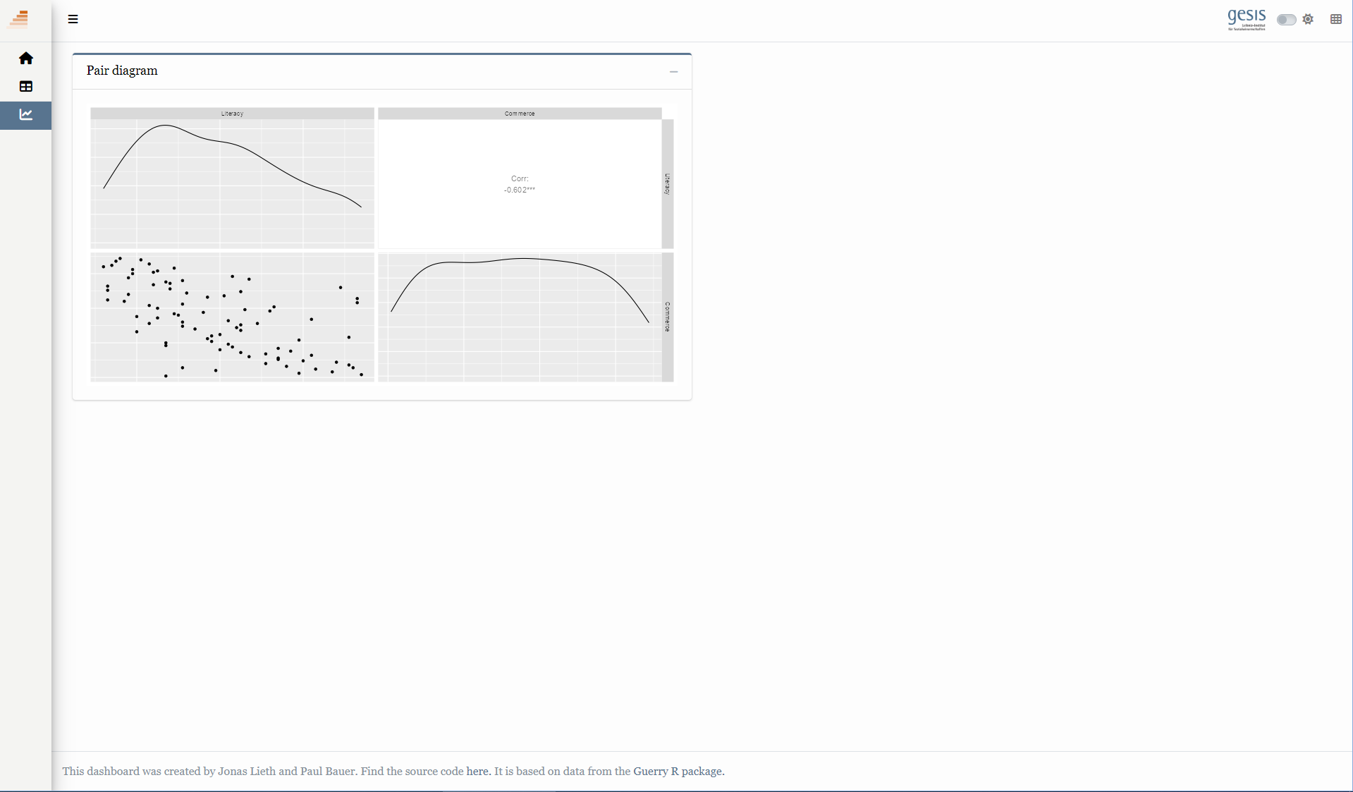
library(shiny)library(htmltools)library(bs4Dash)library(shinyWidgets)library(Guerry)library(sf)library(dplyr)library(GGally)# 1 Data preparation ----## Load & clean data ----variable_names <-list(Crime_pers ="Crime against persons", Crime_prop ="Crime against property", Literacy ="Literacy", Donations ="Donations to the poor", Infants ="Illegitimate births", Suicides ="Suicides", Wealth ="Tax / capita", Commerce ="Commerce & Industry", Clergy ="Clergy", Crime_parents ="Crime against parents", Infanticide ="Infanticides", Donation_clergy ="Donations to the clergy", Lottery ="Wager on Royal Lottery", Desertion ="Military desertion", Instruction ="Instruction", Prostitutes ="Prostitutes", Distance ="Distance to paris", Area ="Area", Pop1831 ="Population")data_guerry <- Guerry::gfrance85 %>%st_as_sf() %>%as_tibble() %>%st_as_sf(crs =27572) %>%mutate(Region =case_match( Region,"C"~"Central","E"~"East","N"~"North","S"~"South","W"~"West" )) %>%select(-c("COUNT", "dept", "AVE_ID_GEO", "CODE_DEPT")) %>%select(Region:Department, all_of(names(variable_names)))## Prep data (Tab: Tabulate data) ----data_guerry_tabulate <- data_guerry %>%st_drop_geometry() %>%mutate(across(.cols =all_of(names(variable_names)), round, 2))## Prep data (Tab: Map data) ----data_guerry_region <- data_guerry %>%group_by(Region) %>%summarise(across(.cols =all_of(names(variable_names)),function(x) {if (cur_column() %in%c("Area", "Pop1831")) {sum(x) } else {mean(x) } } ))## Prepare palettes ----## Used for mappingpals <-list(Sequential = RColorBrewer::brewer.pal.info %>%filter(category %in%"seq") %>%row.names(),Viridis =c("Magma", "Inferno", "Plasma", "Viridis","Cividis", "Rocket", "Mako", "Turbo"))## Prepare modebar clean-up ----## Used for modellingplotly_buttons <-c("sendDataToCloud", "zoom2d", "select2d", "lasso2d", "autoScale2d","hoverClosestCartesian", "hoverCompareCartesian", "resetScale2d")# 3 UI ----ui <-dashboardPage(title ="The Guerry Dashboard",## 3.1 Header ----header =dashboardHeader(title =tagList(img(src ="../workshop-logo.png", width =35, height =35),span("The Guerry Dashboard", class ="brand-text") ) ),## 3.2 Sidebar ----sidebar =dashboardSidebar(id ="sidebar",sidebarMenu(id ="sidebarMenu",menuItem(tabName ="tab_intro", text ="Introduction", icon =icon("home")),menuItem(tabName ="tab_tabulate", text ="Tabulate data", icon =icon("table")),menuItem(tabName ="tab_model", text ="Model data", icon =icon("chart-line")),flat =TRUE ),minified =TRUE,collapsed =TRUE,fixed =FALSE,skin ="light" ),## 3.3 Body ----body =dashboardBody(tabItems(### 3.1.1 Tab: Introduction ----tabItem(tabName ="tab_intro",jumbotron(title ="The Guerry Dashboard",lead ="A Shiny app to explore the classic Guerry dataset.",status ="info",btnName =NULL ),fluidRow(column(width =1),column(width =6,box(title ="About",status ="primary",width =12,blockQuote(HTML("André-Michel Guerry was a French lawyer and amateur statistician. Together with Adolphe Quetelet he may be regarded as the founder of moral statistics which led to the development of criminology, sociology and ultimately, modern social science. <br>— Wikipedia: <a href='https://en.wikipedia.org/wiki/Andr%C3%A9-Michel_Guerry'>André-Michel Guerry</a>"),color ="primary"),p(HTML("Andre-Michel Guerry (1833) was the first to systematically collect and analyze social data on such things as crime, literacy and suicide with the view to determining social laws and the relations among these variables. The Guerry data frame comprises a collection of 'moral variables' (cf. <i><a href='https://en.wikipedia.org/wiki/Moral_statistics'>moral statistics</a></i>) on the 86 departments of France around 1830. A few additional variables have been added from other sources. In total the data frame has 86 observations (the departments of France) on 23 variables <i>(Source: <code>?Guerry</code>)</i>. In this app, we aim to explore Guerry’s data using spatial exploration and regression modelling.")),hr(),accordion(id ="accord",accordionItem(title ="References",status ="primary",solidHeader =FALSE,"The following sources are referenced in this app:", tags$ul(class ="list-style: none",style ="margin-left: -30px;",p("Angeville, A. (1836). Essai sur la Statistique de la Population française Paris: F. Doufour."),p("Guerry, A.-M. (1833). Essai sur la statistique morale de la France Paris: Crochard. English translation: Hugh P. Whitt and Victor W. Reinking, Lewiston, N.Y. : Edwin Mellen Press, 2002."),p("Parent-Duchatelet, A. (1836). De la prostitution dans la ville de Paris, 3rd ed, 1857, p. 32, 36"),p("Palsky, G. (2008). Connections and exchanges in European thematic cartography. The case of 19th century choropleth maps. Belgeo 3-4, 413-426.") ) ),accordionItem(title ="Details",status ="primary",solidHeader =FALSE,p("This app was created as part of a Shiny workshop held in July 2023"),p("Last update: June 2023"),p("Further information about the data can be found",a("here.", href ="https://www.datavis.ca/gallery/guerry/guerrydat.html")) ) ) ) ),column(width =4,box(title ="André Michel Guerry",status ="primary",width =12, tags$img(src ="../guerry.jpg", width ="100%"),p("Source: Palsky (2008)") ) ) ) ),### 3.3.2 Tab: Tabulate data ----tabItem(tabName ="tab_tabulate",fluidRow(#### Inputs(s) ----pickerInput("tab_tabulate_select",label ="Filter variables",choices =setNames(names(variable_names), variable_names),options =pickerOptions(actionsBox =TRUE,windowPadding =c(30, 0, 0, 0),liveSearch =TRUE,selectedTextFormat ="count",countSelectedText ="{0} variables selected",noneSelectedText ="No filters applied" ),inline =TRUE,multiple =TRUE ) ),hr(),#### Output(s) (Data table) ---- DT::dataTableOutput("tab_tabulate_table") ),### 3.3.3 Tab: Model data ----tabItem(tabName ="tab_model",fluidRow(column(width =6,##### Box: Pair diagramm ----box(width =12,title ="Pair diagram",status ="primary",plotOutput("pairplot") ) ) ) ) ) # end tabItems ),## 3.4 Footer (bottom)----footer =dashboardFooter(left =span("This dashboard was created by Jonas Lieth and Paul Bauer. Find the source code",a("here.", href ="https://github.com/paulcbauer/shiny_workshop/tree/main/shinyapps/guerry"),"It is based on data from the",a("Guerry R package.", href ="https://cran.r-project.org/web/packages/Guerry/index.html") ) ),## 3.5 Controlbar (top)----controlbar =dashboardControlbar(div(class ="p-3", skinSelector()),skin ="light" ) )# 4 Server ----server <-function(input, output, session) {## 4.1 Tabulate data ----### Variable selection ---- tab <-reactive({ var <- input$tab_tabulate_select data_table <- data_guerry_tabulateif (!is.null(var)) { data_table <- data_table[, var] } data_table })### Create table---- dt <-reactive({ tab <-tab() ridx <-ifelse("Department"%in%names(tab), 3, 1) DT::datatable( tab,class ="hover",extensions =c("Buttons"),selection ="none",filter =list(position ="top", clear =FALSE),style ="bootstrap4",rownames =FALSE,options =list(dom ="Brtip",deferRender =TRUE,scroller =TRUE,buttons =list(list(extend ="copy", text ="Copy to clipboard"),list(extend ="pdf", text ="Save as PDF"),list(extend ="csv", text ="Save as CSV"),list(extend ="excel", text ="Save as JSON", action = DT::JS(" function (e, dt, button, config) { var data = dt.buttons.exportData(); $.fn.dataTable.fileSave( new Blob([JSON.stringify(data)]), 'Shiny dashboard.json' ); } ")) ) ) ) })### Render table---- output$tab_tabulate_table <- DT::renderDataTable(dt(), server =FALSE)## 4.2 Model data ----### Pair diagram ---- output$pairplot <-renderPlot({ dt <-st_drop_geometry(data_guerry[c("Literacy", "Commerce")]) GGally::ggpairs(dt, axisLabels ="none") })}shinyApp(ui, server)
ข้อจำกัด
code ที่ใช้ในการplotนี้เป็นแบบอย่างง่าย ที่ดูไม่ค่อยจะต่างจากคำสั่งplot ต่างๆที่มาด้วยกับ R
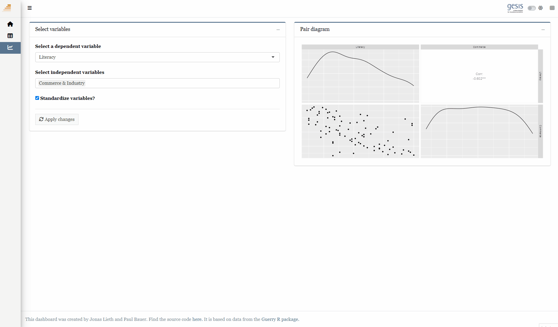
library(shiny)library(htmltools)library(bs4Dash)library(shinyWidgets)library(Guerry)library(sf)library(dplyr)library(plotly)library(GGally)# 1 Data preparation ----## Load & clean data ----variable_names <-list(Crime_pers ="Crime against persons", Crime_prop ="Crime against property", Literacy ="Literacy", Donations ="Donations to the poor", Infants ="Illegitimate births", Suicides ="Suicides", Wealth ="Tax / capita", Commerce ="Commerce & Industry", Clergy ="Clergy", Crime_parents ="Crime against parents", Infanticide ="Infanticides", Donation_clergy ="Donations to the clergy", Lottery ="Wager on Royal Lottery", Desertion ="Military desertion", Instruction ="Instruction", Prostitutes ="Prostitutes", Distance ="Distance to paris", Area ="Area", Pop1831 ="Population")data_guerry <- Guerry::gfrance85 %>%st_as_sf() %>%as_tibble() %>%st_as_sf(crs =27572) %>%mutate(Region =case_match( Region,"C"~"Central","E"~"East","N"~"North","S"~"South","W"~"West" )) %>%select(-c("COUNT", "dept", "AVE_ID_GEO", "CODE_DEPT")) %>%select(Region:Department, all_of(names(variable_names)))## Prep data (Tab: Tabulate data) ----data_guerry_tabulate <- data_guerry %>%st_drop_geometry() %>%mutate(across(.cols =all_of(names(variable_names)), round, 2))## Prepare modebar clean-up ----## Used for modellingplotly_buttons <-c("sendDataToCloud", "zoom2d", "select2d", "lasso2d", "autoScale2d","hoverClosestCartesian", "hoverCompareCartesian", "resetScale2d")# 3 UI ----ui <-dashboardPage(title ="The Guerry Dashboard",## 3.1 Header ----header =dashboardHeader(title =tagList(img(src ="../workshop-logo.png", width =35, height =35),span("The Guerry Dashboard", class ="brand-text") ) ),## 3.2 Sidebar ----sidebar =dashboardSidebar(id ="sidebar",sidebarMenu(id ="sidebarMenu",menuItem(tabName ="tab_intro", text ="Introduction", icon =icon("home")),menuItem(tabName ="tab_tabulate", text ="Tabulate data", icon =icon("table")),menuItem(tabName ="tab_model", text ="Model data", icon =icon("chart-line")),flat =TRUE ),minified =TRUE,collapsed =TRUE,fixed =FALSE,skin ="light" ),## 3.3 Body ----body =dashboardBody(tabItems(### 3.1.1 Tab: Introduction ----tabItem(tabName ="tab_intro",jumbotron(title ="The Guerry Dashboard",lead ="A Shiny app to explore the classic Guerry dataset.",status ="info",btnName =NULL ),fluidRow(column(width =1),column(width =6,box(title ="About",status ="primary",width =12,blockQuote(HTML("André-Michel Guerry was a French lawyer and amateur statistician. Together with Adolphe Quetelet he may be regarded as the founder of moral statistics which led to the development of criminology, sociology and ultimately, modern social science. <br>— Wikipedia: <a href='https://en.wikipedia.org/wiki/Andr%C3%A9-Michel_Guerry'>André-Michel Guerry</a>"),color ="primary"),p(HTML("Andre-Michel Guerry (1833) was the first to systematically collect and analyze social data on such things as crime, literacy and suicide with the view to determining social laws and the relations among these variables. The Guerry data frame comprises a collection of 'moral variables' (cf. <i><a href='https://en.wikipedia.org/wiki/Moral_statistics'>moral statistics</a></i>) on the 86 departments of France around 1830. A few additional variables have been added from other sources. In total the data frame has 86 observations (the departments of France) on 23 variables <i>(Source: <code>?Guerry</code>)</i>. In this app, we aim to explore Guerry’s data using spatial exploration and regression modelling.")),hr(),accordion(id ="accord",accordionItem(title ="References",status ="primary",solidHeader =FALSE,"The following sources are referenced in this app:", tags$ul(class ="list-style: none",style ="margin-left: -30px;",p("Angeville, A. (1836). Essai sur la Statistique de la Population française Paris: F. Doufour."),p("Guerry, A.-M. (1833). Essai sur la statistique morale de la France Paris: Crochard. English translation: Hugh P. Whitt and Victor W. Reinking, Lewiston, N.Y. : Edwin Mellen Press, 2002."),p("Parent-Duchatelet, A. (1836). De la prostitution dans la ville de Paris, 3rd ed, 1857, p. 32, 36"),p("Palsky, G. (2008). Connections and exchanges in European thematic cartography. The case of 19th century choropleth maps. Belgeo 3-4, 413-426.") ) ),accordionItem(title ="Details",status ="primary",solidHeader =FALSE,p("This app was created as part of a Shiny workshop held in July 2023"),p("Last update: June 2023"),p("Further information about the data can be found",a("here.", href ="https://www.datavis.ca/gallery/guerry/guerrydat.html")) ) ) ) ),column(width =4,box(title ="André Michel Guerry",status ="primary",width =12, tags$img(src ="../guerry.jpg", width ="100%"),p("Source: Palsky (2008)") ) ) ) ),### 3.3.2 Tab: Tabulate data ----tabItem(tabName ="tab_tabulate",fluidRow(#### Inputs(s) ----pickerInput("tab_tabulate_select",label ="Filter variables",choices =setNames(names(variable_names), variable_names),options =pickerOptions(actionsBox =TRUE,windowPadding =c(30, 0, 0, 0),liveSearch =TRUE,selectedTextFormat ="count",countSelectedText ="{0} variables selected",noneSelectedText ="No filters applied" ),inline =TRUE,multiple =TRUE ) ),hr(),#### Output(s) (Data table) ---- DT::dataTableOutput("tab_tabulate_table") ),### 3.3.3 Tab: Model data ----tabItem(tabName ="tab_model",fluidRow(column(width =6,#### Inputs(s) ----box(width =12,title ="Select variables",status ="primary",selectInput("model_x",label ="Select a dependent variable",choices =setNames(names(variable_names), variable_names),selected ="Literacy" ),selectizeInput("model_y",label ="Select independent variables",choices =setNames(names(variable_names), variable_names),multiple =TRUE,selected ="Commerce" ),checkboxInput("model_std",label ="Standardize variables?",value =TRUE ),hr(),actionButton("refresh",label ="Apply changes",icon =icon("refresh"),flat =TRUE ) ) ),column(width =6,##### Box: Pair diagramm ----box(width =12,title ="Pair diagram",status ="primary",plotOutput("pairplot") )# A fourth box can go here :) ) ) ) ) # end tabItems ),## 3.4 Footer (bottom)----footer =dashboardFooter(left =span("This dashboard was created by Jonas Lieth and Paul Bauer. Find the source code",a("here.", href ="https://github.com/paulcbauer/shiny_workshop/tree/main/shinyapps/guerry"),"It is based on data from the",a("Guerry R package.", href ="https://cran.r-project.org/web/packages/Guerry/index.html") ) ),## 3.5 Controlbar (top)----controlbar =dashboardControlbar(div(class ="p-3", skinSelector()),skin ="light" ) )# 4 Server ----server <-function(input, output, session) {## 4.1 Tabulate data ----### Variable selection ---- tab <-reactive({ var <- input$tab_tabulate_select data_table <- data_guerry_tabulateif (!is.null(var)) { data_table <- data_table[, var] } data_table })### Create table---- dt <-reactive({ tab <-tab() ridx <-ifelse("Department"%in%names(tab), 3, 1) DT::datatable( tab,class ="hover",extensions =c("Buttons"),selection ="none",filter =list(position ="top", clear =FALSE),style ="bootstrap4",rownames =FALSE,options =list(dom ="Brtip",deferRender =TRUE,scroller =TRUE,buttons =list(list(extend ="copy", text ="Copy to clipboard"),list(extend ="pdf", text ="Save as PDF"),list(extend ="csv", text ="Save as CSV"),list(extend ="excel", text ="Save as JSON", action = DT::JS(" function (e, dt, button, config) { var data = dt.buttons.exportData(); $.fn.dataTable.fileSave( new Blob([JSON.stringify(data)]), 'Shiny dashboard.json' ); } ")) ) ) ) })### Render table---- output$tab_tabulate_table <- DT::renderDataTable(dt(), server =FALSE)## 4.2 Model data ----### Define & estimate model ---- dat <-reactive({ x <- input$model_x y <- input$model_y dt <- sf::st_drop_geometry(data_guerry)[c(x, y)]if (input$model_std) dt <- datawizard::standardise(dt) dt }) %>%bindEvent(input$refresh, ignoreNULL =FALSE)### Pair diagram ---- output$pairplot <-renderPlot({ GGally::ggpairs(dat(), axisLabels ="none") })}shinyApp(ui, server)
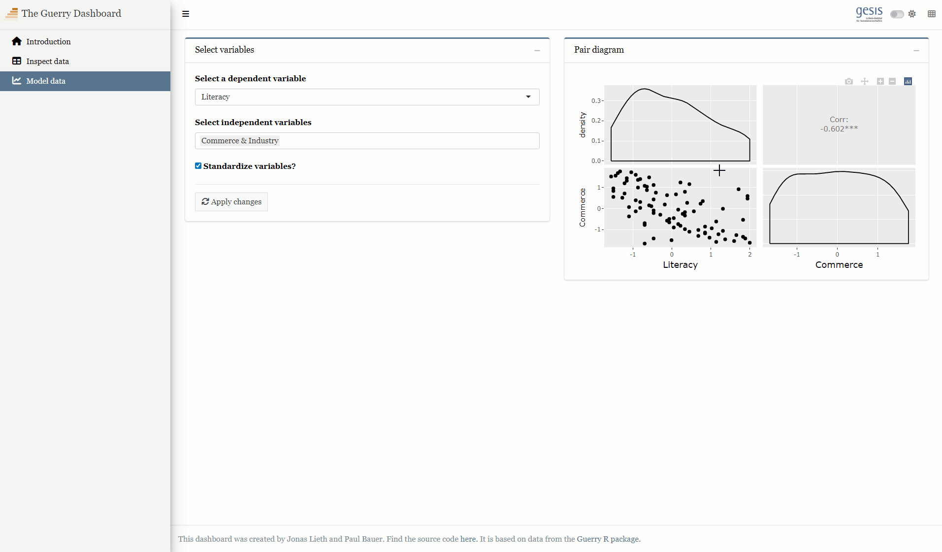
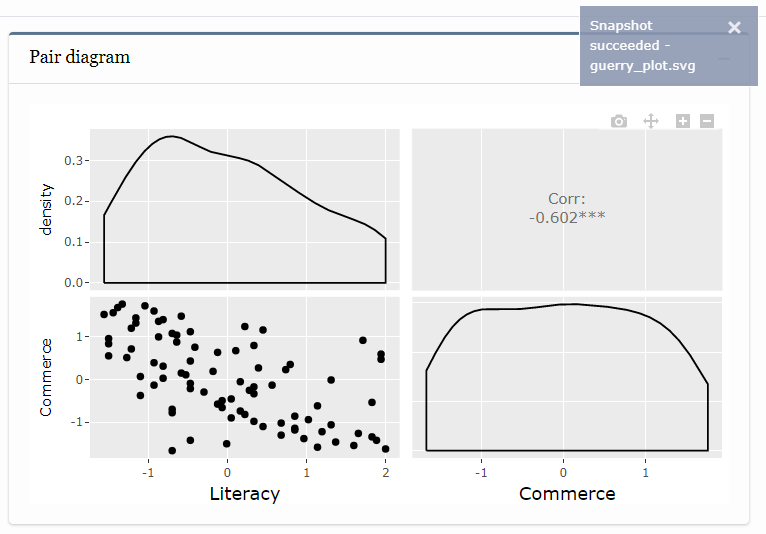
library(shiny)library(htmltools)library(bs4Dash)library(shinyWidgets)library(Guerry)library(sf)library(dplyr)library(plotly)library(GGally)library(datawizard)# 1 Data preparation ----## Load & clean data ----variable_names <-list(Crime_pers ="Crime against persons", Crime_prop ="Crime against property", Literacy ="Literacy", Donations ="Donations to the poor", Infants ="Illegitimate births", Suicides ="Suicides", Wealth ="Tax / capita", Commerce ="Commerce & Industry", Clergy ="Clergy", Crime_parents ="Crime against parents", Infanticide ="Infanticides", Donation_clergy ="Donations to the clergy", Lottery ="Wager on Royal Lottery", Desertion ="Military desertion", Instruction ="Instruction", Prostitutes ="Prostitutes", Distance ="Distance to paris", Area ="Area", Pop1831 ="Population")data_guerry <- Guerry::gfrance85 %>%st_as_sf() %>%as_tibble() %>%st_as_sf(crs =27572) %>%mutate(Region =case_match( Region,"C"~"Central","E"~"East","N"~"North","S"~"South","W"~"West" )) %>%select(-c("COUNT", "dept", "AVE_ID_GEO", "CODE_DEPT")) %>%select(Region:Department, all_of(names(variable_names)))## Prep data (Tab: Tabulate data) ----data_guerry_tabulate <- data_guerry %>%st_drop_geometry() %>%mutate(across(.cols =all_of(names(variable_names)), round, 2))## Prepare modebar clean-up ----## Used for modellingplotly_buttons <-c("sendDataToCloud", "zoom2d", "select2d", "lasso2d", "autoScale2d","hoverClosestCartesian", "hoverCompareCartesian", "resetScale2d")# 3 UI ----ui <-dashboardPage(title ="The Guerry Dashboard",## 3.1 Header ----header =dashboardHeader(title =tagList(img(src ="../workshop-logo.png", width =35, height =35),span("The Guerry Dashboard", class ="brand-text") ) ),## 3.2 Sidebar ----sidebar =dashboardSidebar(id ="sidebar",sidebarMenu(id ="sidebarMenu",menuItem(tabName ="tab_intro", text ="Introduction", icon =icon("home")),menuItem(tabName ="tab_tabulate", text ="Tabulate data", icon =icon("table")),menuItem(tabName ="tab_model", text ="Model data", icon =icon("chart-line")),flat =TRUE ),minified =TRUE,collapsed =TRUE,fixed =FALSE,skin ="light" ),## 3.3 Body ----body =dashboardBody(tabItems(### 3.1.1 Tab: Introduction ----tabItem(tabName ="tab_intro",jumbotron(title ="The Guerry Dashboard",lead ="A Shiny app to explore the classic Guerry dataset.",status ="info",btnName =NULL ),fluidRow(column(width =1),column(width =6,box(title ="About",status ="primary",width =12,blockQuote(HTML("André-Michel Guerry was a French lawyer and amateur statistician. Together with Adolphe Quetelet he may be regarded as the founder of moral statistics which led to the development of criminology, sociology and ultimately, modern social science. <br>— Wikipedia: <a href='https://en.wikipedia.org/wiki/Andr%C3%A9-Michel_Guerry'>André-Michel Guerry</a>"),color ="primary"),p(HTML("Andre-Michel Guerry (1833) was the first to systematically collect and analyze social data on such things as crime, literacy and suicide with the view to determining social laws and the relations among these variables. The Guerry data frame comprises a collection of 'moral variables' (cf. <i><a href='https://en.wikipedia.org/wiki/Moral_statistics'>moral statistics</a></i>) on the 86 departments of France around 1830. A few additional variables have been added from other sources. In total the data frame has 86 observations (the departments of France) on 23 variables <i>(Source: <code>?Guerry</code>)</i>. In this app, we aim to explore Guerry’s data using spatial exploration and regression modelling.")),hr(),accordion(id ="accord",accordionItem(title ="References",status ="primary",solidHeader =FALSE,"The following sources are referenced in this app:", tags$ul(class ="list-style: none",style ="margin-left: -30px;",p("Angeville, A. (1836). Essai sur la Statistique de la Population française Paris: F. Doufour."),p("Guerry, A.-M. (1833). Essai sur la statistique morale de la France Paris: Crochard. English translation: Hugh P. Whitt and Victor W. Reinking, Lewiston, N.Y. : Edwin Mellen Press, 2002."),p("Parent-Duchatelet, A. (1836). De la prostitution dans la ville de Paris, 3rd ed, 1857, p. 32, 36"),p("Palsky, G. (2008). Connections and exchanges in European thematic cartography. The case of 19th century choropleth maps. Belgeo 3-4, 413-426.") ) ),accordionItem(title ="Details",status ="primary",solidHeader =FALSE,p("This app was created as part of a Shiny workshop held in July 2023"),p("Last update: June 2023"),p("Further information about the data can be found",a("here.", href ="https://www.datavis.ca/gallery/guerry/guerrydat.html")) ) ) ) ),column(width =4,box(title ="André Michel Guerry",status ="primary",width =12, tags$img(src ="../guerry.jpg", width ="100%"),p("Source: Palsky (2008)") ) ) ) ),### 3.3.2 Tab: Tabulate data ----tabItem(tabName ="tab_tabulate",fluidRow(#### Inputs(s) ----pickerInput("tab_tabulate_select",label ="Filter variables",choices =setNames(names(variable_names), variable_names),options =pickerOptions(actionsBox =TRUE,windowPadding =c(30, 0, 0, 0),liveSearch =TRUE,selectedTextFormat ="count",countSelectedText ="{0} variables selected",noneSelectedText ="No filters applied" ),inline =TRUE,multiple =TRUE ) ),hr(),#### Output(s) (Data table) ---- DT::dataTableOutput("tab_tabulate_table") ),### 3.3.3 Tab: Model data ----tabItem(tabName ="tab_model",fluidRow(column(width =6,#### Inputs(s) ----box(width =12,title ="Select variables",status ="primary",selectInput("model_x",label ="Select a dependent variable",choices =setNames(names(variable_names), variable_names),selected ="Literacy" ),selectizeInput("model_y",label ="Select independent variables",choices =setNames(names(variable_names), variable_names),multiple =TRUE,selected ="Commerce" ),checkboxInput("model_std",label ="Standardize variables?",value =TRUE ),hr(),actionButton("refresh",label ="Apply changes",icon =icon("refresh"),flat =TRUE ) ) ),column(width =6,##### Box: Pair diagramm ----box(width =12,title ="Pair diagram",status ="primary", plotly::plotlyOutput("pairplot") )# A fourth box can go here :) ) ) ) ) # end tabItems ),## 3.4 Footer (bottom)----footer =dashboardFooter(left =span("This dashboard was created by Jonas Lieth and Paul Bauer. Find the source code",a("here.", href ="https://github.com/paulcbauer/shiny_workshop/tree/main/shinyapps/guerry"),"It is based on data from the",a("Guerry R package.", href ="https://cran.r-project.org/web/packages/Guerry/index.html") ) ),## 3.5 Controlbar (top)----controlbar =dashboardControlbar(div(class ="p-3", skinSelector()),skin ="light" ) )# 4 Server ----server <-function(input, output, session) {## 4.1 Tabulate data ----### Variable selection ---- tab <-reactive({ var <- input$tab_tabulate_select data_table <- data_guerry_tabulateif (!is.null(var)) { data_table <- data_table[, var] } data_table })### Create table---- dt <-reactive({ tab <-tab() ridx <-ifelse("Department"%in%names(tab), 3, 1) DT::datatable( tab,class ="hover",extensions =c("Buttons"),selection ="none",filter =list(position ="top", clear =FALSE),style ="bootstrap4",rownames =FALSE,options =list(dom ="Brtip",deferRender =TRUE,scroller =TRUE,buttons =list(list(extend ="copy", text ="Copy to clipboard"),list(extend ="pdf", text ="Save as PDF"),list(extend ="csv", text ="Save as CSV"),list(extend ="excel", text ="Save as JSON", action = DT::JS(" function (e, dt, button, config) { var data = dt.buttons.exportData(); $.fn.dataTable.fileSave( new Blob([JSON.stringify(data)]), 'Shiny dashboard.json' ); } ")) ) ) ) })### Render table---- output$tab_tabulate_table <- DT::renderDataTable(dt(), server =FALSE)## 4.2 Model data ----### Define & estimate model ---- dat <-reactive({ x <- input$model_x y <- input$model_y dt <- sf::st_drop_geometry(data_guerry)[c(x, y)]if (input$model_std) dt <- datawizard::standardise(dt) dt }) %>%bindEvent(input$refresh, ignoreNULL =FALSE)### Pair diagram ---- output$pairplot <- plotly::renderPlotly({ p <- GGally::ggpairs(dat(), axisLabels ="none")ggplotly(p) %>%config(modeBarButtonsToRemove = plotly_buttons,displaylogo =FALSE,toImageButtonOptions =list(format ="svg",filename ="guerry_plot",height =NULL,width =NULL ),scrollZoom =TRUE ) })}shinyApp(ui, server)
1mparams <-reactive({ x <- input$model_x y <- input$model_y dt <- sf::st_drop_geometry(guerry)[c(x, y)]if (input$model_std) dt <- datawizard::standardise(dt)2 form <-as.formula(paste(x, "~", paste(y, collapse =" + "))) mod <-lm(form, data = dt)3list(x = x, y = y, data = dt, model = mod)}) %>%bindEvent(input$refresh, ignoreNULL =FALSE)
สร้างแผนภูมิกระจายของ Plotly สำหรับการถดถอยแบบสองตัวแปร หากเลือกตัวแปร y มากกว่าหนึ่งตัว จะสร้างแผนภูมิที่ว่างเปล่าและแสดงข้อความเตือน
4
สร้างตารางของโมเดลโดยใช้แพ็คเกจ modelsummary และเตรียมสำหรับการแสดงผลแบบ HTML
code ตัวเต็ม
Full code for contextual visualization
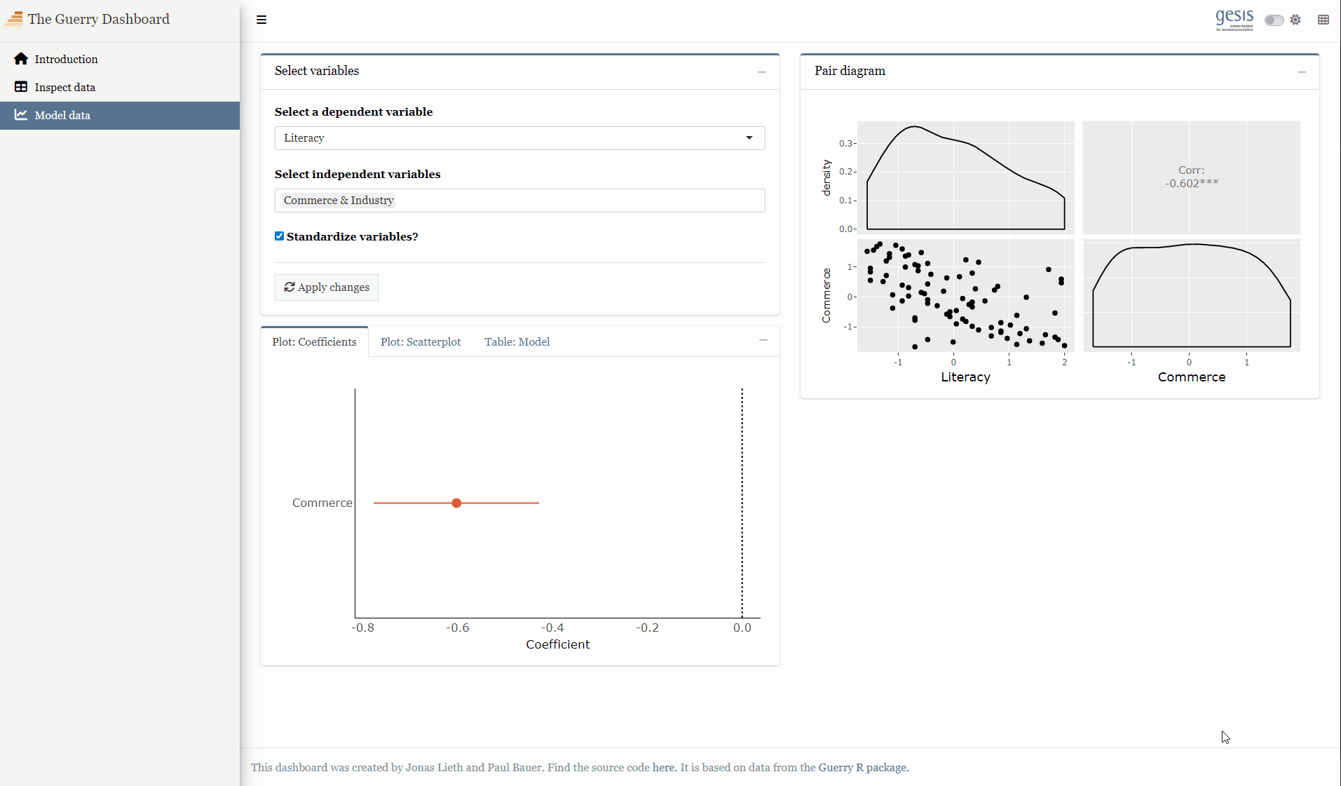
library(shiny)library(htmltools)library(bs4Dash)library(shinyWidgets)library(Guerry)library(sf)library(dplyr)library(plotly)library(ggplot2)library(GGally)library(datawizard)library(parameters)library(performance)library(modelsummary)# 1 Data preparation ----## Load & clean data ----variable_names <-list(Crime_pers ="Crime against persons", Crime_prop ="Crime against property", Literacy ="Literacy", Donations ="Donations to the poor", Infants ="Illegitimate births", Suicides ="Suicides", Wealth ="Tax / capita", Commerce ="Commerce & Industry", Clergy ="Clergy", Crime_parents ="Crime against parents", Infanticide ="Infanticides", Donation_clergy ="Donations to the clergy", Lottery ="Wager on Royal Lottery", Desertion ="Military desertion", Instruction ="Instruction", Prostitutes ="Prostitutes", Distance ="Distance to paris", Area ="Area", Pop1831 ="Population")data_guerry <- Guerry::gfrance85 %>%st_as_sf() %>%as_tibble() %>%st_as_sf(crs =27572) %>%mutate(Region =case_match( Region,"C"~"Central","E"~"East","N"~"North","S"~"South","W"~"West" )) %>%select(-c("COUNT", "dept", "AVE_ID_GEO", "CODE_DEPT")) %>%select(Region:Department, all_of(names(variable_names)))## Prep data (Tab: Tabulate data) ----data_guerry_tabulate <- data_guerry %>%st_drop_geometry() %>%mutate(across(.cols =all_of(names(variable_names)), round, 2))## Prepare modebar clean-up ----## Used for modellingplotly_buttons <-c("sendDataToCloud", "zoom2d", "select2d", "lasso2d", "autoScale2d","hoverClosestCartesian", "hoverCompareCartesian", "resetScale2d")# 3 UI ----ui <-dashboardPage(title ="The Guerry Dashboard",## 3.1 Header ----header =dashboardHeader(title =tagList(img(src ="../workshop-logo.png", width =35, height =35),span("The Guerry Dashboard", class ="brand-text") ) ),## 3.2 Sidebar ----sidebar =dashboardSidebar(id ="sidebar",sidebarMenu(id ="sidebarMenu",menuItem(tabName ="tab_intro", text ="Introduction", icon =icon("home")),menuItem(tabName ="tab_tabulate", text ="Tabulate data", icon =icon("table")),menuItem(tabName ="tab_model", text ="Model data", icon =icon("chart-line")),flat =TRUE ),minified =TRUE,collapsed =TRUE,fixed =FALSE,skin ="light" ),## 3.3 Body ----body =dashboardBody(tabItems(### 3.1.1 Tab: Introduction ----tabItem(tabName ="tab_intro",jumbotron(title ="The Guerry Dashboard",lead ="A Shiny app to explore the classic Guerry dataset.",status ="info",btnName =NULL ),fluidRow(column(width =1),column(width =6,box(title ="About",status ="primary",width =12,blockQuote(HTML("André-Michel Guerry was a French lawyer and amateur statistician. Together with Adolphe Quetelet he may be regarded as the founder of moral statistics which led to the development of criminology, sociology and ultimately, modern social science. <br>— Wikipedia: <a href='https://en.wikipedia.org/wiki/Andr%C3%A9-Michel_Guerry'>André-Michel Guerry</a>"),color ="primary"),p(HTML("Andre-Michel Guerry (1833) was the first to systematically collect and analyze social data on such things as crime, literacy and suicide with the view to determining social laws and the relations among these variables. The Guerry data frame comprises a collection of 'moral variables' (cf. <i><a href='https://en.wikipedia.org/wiki/Moral_statistics'>moral statistics</a></i>) on the 86 departments of France around 1830. A few additional variables have been added from other sources. In total the data frame has 86 observations (the departments of France) on 23 variables <i>(Source: <code>?Guerry</code>)</i>. In this app, we aim to explore Guerry’s data using spatial exploration and regression modelling.")),hr(),accordion(id ="accord",accordionItem(title ="References",status ="primary",solidHeader =FALSE,"The following sources are referenced in this app:", tags$ul(class ="list-style: none",style ="margin-left: -30px;",p("Angeville, A. (1836). Essai sur la Statistique de la Population française Paris: F. Doufour."),p("Guerry, A.-M. (1833). Essai sur la statistique morale de la France Paris: Crochard. English translation: Hugh P. Whitt and Victor W. Reinking, Lewiston, N.Y. : Edwin Mellen Press, 2002."),p("Parent-Duchatelet, A. (1836). De la prostitution dans la ville de Paris, 3rd ed, 1857, p. 32, 36"),p("Palsky, G. (2008). Connections and exchanges in European thematic cartography. The case of 19th century choropleth maps. Belgeo 3-4, 413-426.") ) ),accordionItem(title ="Details",status ="primary",solidHeader =FALSE,p("This app was created as part of a Shiny workshop held in July 2023"),p("Last update: June 2023"),p("Further information about the data can be found",a("here.", href ="https://www.datavis.ca/gallery/guerry/guerrydat.html")) ) ) ) ),column(width =4,box(title ="André Michel Guerry",status ="primary",width =12, tags$img(src ="../guerry.jpg", width ="100%"),p("Source: Palsky (2008)") ) ) ) ),### 3.3.2 Tab: Tabulate data ----tabItem(tabName ="tab_tabulate",fluidRow(#### Inputs(s) ----pickerInput("tab_tabulate_select",label ="Filter variables",choices =setNames(names(variable_names), variable_names),options =pickerOptions(actionsBox =TRUE,windowPadding =c(30, 0, 0, 0),liveSearch =TRUE,selectedTextFormat ="count",countSelectedText ="{0} variables selected",noneSelectedText ="No filters applied" ),inline =TRUE,multiple =TRUE ) ),hr(),#### Output(s) (Data table) ---- DT::dataTableOutput("tab_tabulate_table") ),### 3.3.3 Tab: Model data ----tabItem(tabName ="tab_model",fluidRow(column(width =6,#### Inputs(s) ----box(width =12,title ="Select variables",status ="primary",selectInput("model_x",label ="Select a dependent variable",choices =setNames(names(variable_names), variable_names),selected ="Literacy" ),selectizeInput("model_y",label ="Select independent variables",choices =setNames(names(variable_names), variable_names),multiple =TRUE,selected ="Commerce" ),checkboxInput("model_std",label ="Standardize variables?",value =TRUE ),hr(),actionButton("refresh",label ="Apply changes",icon =icon("refresh"),flat =TRUE ) ),#### Outputs(s) ----tabBox(status ="primary",type ="tabs",title ="Model analysis",side ="right",width =12,##### Tabpanel: Coefficient plot ----tabPanel(title ="Plot: Coefficients", plotly::plotlyOutput("coefficientplot") ),##### Tabpanel: Scatterplot ----tabPanel(title ="Plot: Scatterplot", plotly::plotlyOutput("scatterplot") ),##### Tabpanel: Table: Regression ----tabPanel(title ="Table: Model",htmlOutput("tableregression") ) ) ),column(width =6,##### Box: Pair diagramm ----box(width =12,title ="Pair diagram",status ="primary", plotly::plotlyOutput("pairplot") )# A fourth box can go here :) ) ) ) ) # end tabItems ),## 3.4 Footer (bottom)----footer =dashboardFooter(left =span("This dashboard was created by Jonas Lieth and Paul Bauer. Find the source code",a("here.", href ="https://github.com/paulcbauer/shiny_workshop/tree/main/shinyapps/guerry"),"It is based on data from the",a("Guerry R package.", href ="https://cran.r-project.org/web/packages/Guerry/index.html") ) ),## 3.5 Controlbar (top)----controlbar =dashboardControlbar(div(class ="p-3", skinSelector()),skin ="light" ) )# 4 Server ----server <-function(input, output, session) {## 4.1 Tabulate data ----### Variable selection ---- tab <-reactive({ var <- input$tab_tabulate_select data_table <- data_guerry_tabulateif (!is.null(var)) { data_table <- data_table[, var] } data_table })### Create table---- dt <-reactive({ tab <-tab() ridx <-ifelse("Department"%in%names(tab), 3, 1) DT::datatable( tab,class ="hover",extensions =c("Buttons"),selection ="none",filter =list(position ="top", clear =FALSE),style ="bootstrap4",rownames =FALSE,options =list(dom ="Brtip",deferRender =TRUE,scroller =TRUE,buttons =list(list(extend ="copy", text ="Copy to clipboard"),list(extend ="pdf", text ="Save as PDF"),list(extend ="csv", text ="Save as CSV"),list(extend ="excel", text ="Save as JSON", action = DT::JS(" function (e, dt, button, config) { var data = dt.buttons.exportData(); $.fn.dataTable.fileSave( new Blob([JSON.stringify(data)]), 'Shiny dashboard.json' ); } ")) ) ) ) })### Render table---- output$tab_tabulate_table <- DT::renderDataTable(dt(), server =FALSE)## 4.2 Model data ----### Define & estimate model ---- mparams <-reactive({ x <- input$model_x y <- input$model_y dt <- sf::st_drop_geometry(data_guerry)[c(x, y)] dt_labels <- sf::st_drop_geometry(data_guerry)[c("Department", "Region")]if (input$model_std) dt <- datawizard::standardise(dt) form <-as.formula(paste(x, "~", paste(y, collapse =" + "))) mod <-lm(form, data = dt)list(x = x,y = y,data = dt,data_labels = dt_labels,model = mod ) }) %>%bindEvent(input$refresh, ignoreNULL =FALSE)### Pair diagram ---- output$pairplot <- plotly::renderPlotly({ params <-mparams() dt <- params$data dt_labels <- params$data_labels p <- GGally::ggpairs(params$data, axisLabels ="none")ggplotly(p) %>%config(modeBarButtonsToRemove = plotly_buttons,displaylogo =FALSE) })### Plot: Coefficientplot ---- output$coefficientplot <-renderPlotly({ params <-mparams() dt <- params$data x <- params$x y <- params$y p <-plot(parameters::model_parameters(params$model))ggplotly(p) %>%config(modeBarButtonsToRemove = plotly_buttons,displaylogo =FALSE) })### Plot: Scatterplot ---- output$scatterplot <-renderPlotly({ params <-mparams() dt <- params$data dt_labels <- params$data_labels x <- params$x y <- params$yif (length(y) ==1) { p <-ggplot(params$data, aes(x = .data[[params$x]], y = .data[[params$y]])) +geom_point(aes(text =paste0("Department: ", dt_labels[["Department"]],"<br>Region: ", dt_labels[["Region"]])),color ="black") +geom_smooth() +geom_smooth(method ="lm") +theme_light() } else { p <-ggplot() +theme_void() +annotate("text", label ="Cannot create scatterplot.\nMore than two variables selected.", x =0, y =0, size =5, colour ="red",hjust =0.5,vjust =0.5) +xlab(NULL) }ggplotly(p) %>%config(modeBarButtonsToRemove = plotly_buttons,displaylogo =FALSE) })### Table: Regression ---- output$tableregression <-renderUI({ params <-mparams()HTML(modelsummary(dvnames(list(params$model)),gof_omit ="AIC|BIC|Log|Adj|RMSE" )) })}shinyApp(ui, server)